Machine Learning Crash Course: Part 1
06 Nov 2016 | Daniel Geng and Shannon ShihIntroduction, Regression/Classification, Cost Functions, and Gradient Descent
Machine learning (ML) has received a lot of attention recently, and not without good reason. It has already revolutionized fields from image recognition to healthcare to transportation. Yet a typical explanation for machine learning sounds like this:
“A computer program is said to learn from experience E with respect to some class of tasks T and performance measure P if its performance at tasks in T, as measured by P, improves with experience E.”
Not very clear, is it? This post, the first in a series of ML tutorials, aims to make machine learning accessible to anyone willing to learn. We’ve designed it to give you a solid understanding of how ML algorithms work as well as provide you the knowledge to harness it in your projects.
So what is Machine Learning?
At its core, machine learning is not a difficult concept to grasp. In fact, the vast majority of machine learning algorithms are concerned with just one simple task: drawing lines. In particular, machine learning is all about drawing lines through data. What does that mean? Let’s look at a simple example.
Classification
Let’s say you’re a computer with a collection of apple and orange images. From each image you can infer the color and size of a fruit, and you want to classify the images as either an image of an apple or an orange. The first step in many machine learning algorithms is to obtain labeled training data. In our example, this means getting a large number of images of fruit each labeled as either being an apple or an orange. From these images, we can extract the color and size information and then see how they correlate with being an apple or an orange. For example, graphing our labeled training data might look like something this:

The red x’s are labeled apples and the orange x’s are labeled oranges. As you’ll probably notice there’s a pattern in the data. Apples seem to congregate on the left side of the graph because they’re mostly red, and oranges seem to congregate on the right side because they’re mostly orange. We want our algorithm to learn these types of patterns.
For this particular problem, our goal is to create an algorithm that draws a line between the two labeled groups, called a decision boundary. The simplest decision boundary for our data might look something like this:
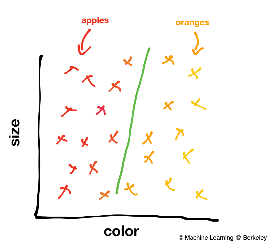
Just a straight line between the apples and the oranges. However, much more complicated machine learning algorithms may end up drawing much more complicated decision boundaries such as this:
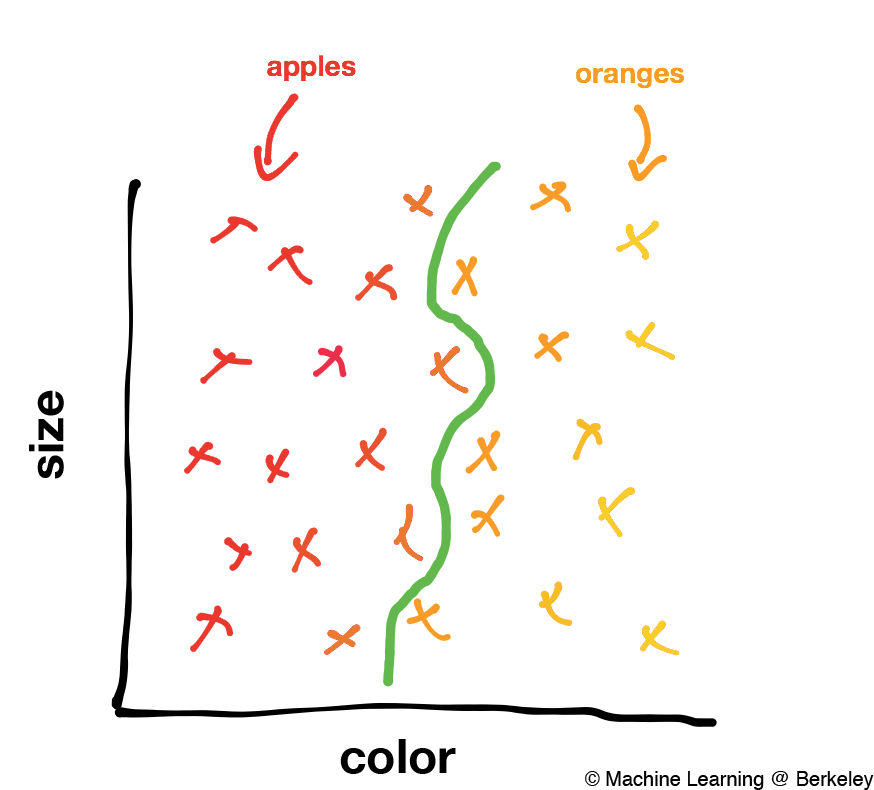
Our assumption is that the line we’ve drawn to distinguish an apple image from an orange image in our labeled training data above will be able to distinguish an apple from an orange in any image. In other words, by giving our algorithm examples of apples and oranges to learn from, it can generalize its experience to images of apples and oranges that it has never encountered before. For instance, if we were given an image of a fruit, represented by the blue X below, we could classify it as an orange based on the decision boundary we drew:
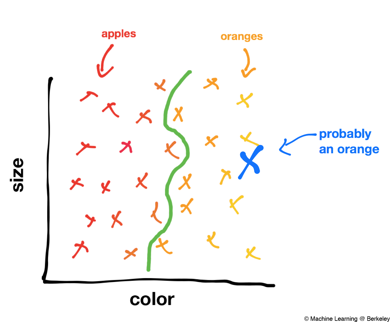
This is the power of machine learning. We take some training data, run a machine learning algorithm which draws a decision boundary on the data, and then extrapolate what we’ve learned to completely new pieces of data.
Of course, distinguishing between apples and oranges is quite a mundane task. However, we can apply this strategy to much more exciting problems, such as classifying tumors as malignant or benign, marking emails as spam or not spam, or analyzing fingerprints for security systems. This type of machine learning—drawing lines to separate data—is just one subfield of machine learning, called classification. Another subfield, called regression, is all about drawing lines that describe data.
Regression
Say we have some labeled training data. In particular, let’s say we have the price of various houses versus their square footage. If we visualize the information as a graph, it looks like this:

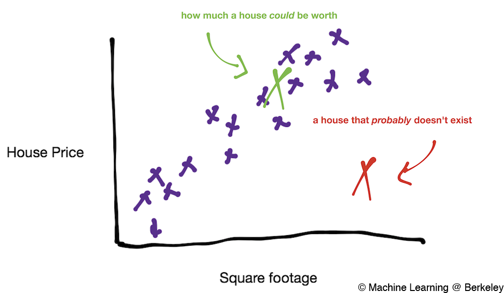
Each of the X’s represents a different house with some price and some square footage. Notice that although there is some variation in the data (in other words, each data point is a bit scattered), there is also a pattern: as houses get bigger, they also become more expensive. We want our algorithm to find and use this pattern to predict house prices based on house size.
Just by looking at the training data intuitively we can see that there is a diagonal strip in the graph that most houses seem to land on. We can generalize this idea and say that all houses will have a high probability of being on the diagonal cluster of data points. For example, there is a pretty high chance of a house being at the green X in the graph below and a pretty low chance that a house would be at the red X in the graph below.
Now we can generalize even more and ask, for any given square footage, how much will a house be worth? Of course, it would be very hard to get an exact answer. However, an approximate answer is much easier to get. To do this, we draw a line through the cluster of data, as close as possible to each data point. This line, called a predictor, predicts the price of a house from its square footage. For any point on the predictor, there is a high chance that a house of that square footage has that price. In a sense, we can say that the predictor represents an “average” of house prices for a given footage.
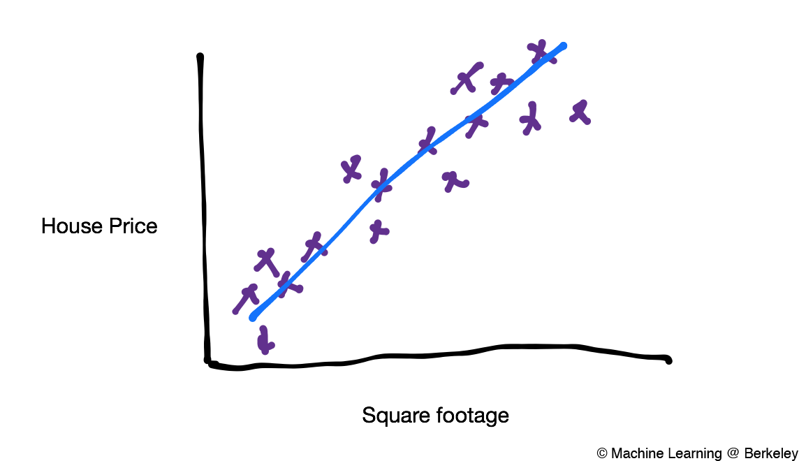
The predictor doesn’t necessarily have to be linear. It can be any type of function, or model, you can imagine—quadratic, sinusoidal, and even arbitrary functions will work. However, using the most complex model for a predictor won’t always work; different functions work better for different problems, and it’s up to the programmer to figure out what kind of model to use.
Looking back at our model for house price we could ask: why limit ourselves to just one input variable? Turns out we can consider as many types of information as we want, such as the cost of living in the city, condition, building material, and so on. For example, we can plot the price against the cost of living in the house’s location and its square footage on a single graph like this, where the vertical axis plots price, and the two horizontal axes plot square footage and cost of living:
In this case we can again fit a predictor to the data. But instead of drawing a line through the data we have to draw a plane through the data because the function that best predicts the housing price is a function of two variables.
So we’ve seen examples of one and two input variables, but many machine learning applications take into account hundreds and even thousands of variables. Although humans are regrettably unable to visualize anything higher than three dimensions, the same principles we just learned will apply to those systems.
The Predictor
As we mentioned earlier, there are many different types of predictors. In our example with house prices, we used a linear model to approximate our data. The mathematical form of a linear predictor looks something like this:
\[f\left( x \right)\; =\; c_{n}x_{n}\; +\; c_{n-1}x_{n-1}\; +\; …\; +\; c_{1}x_{1}\; +\; c_{0}\]Each x represents a different input feature, such as square footage or cost of living, and each c is called a parameter or a weight. The greater a particular weight is, the more the model considers its corresponding feature. For example, square footage is a good predictor of house prices, so our algorithm should give square footage a lot of consideration by increasing the coefficient associated with square footage. In contrast, if our data included the number of power outlets in the house, our algorithm will probably give it a relatively low weight because the number of outlets doesn’t have much to do with the price of a house.
In our example of predicting house prices based on square footage, since we’re only considering one variable our model only needs one input feature, or just one x:
\[y\left( x \right)=c_{1}x+c_{0}\]This equation is probably more recognizable in this form:
\[y=mx+b\]\(y(x)\) is our output, or in this case the price of a house, and \(x\) is our feature, or in this case the size of the house. \(c_{0}\) is the y intercept, to account for the base price of the house.
Now the question becomes: How does a machine learning algorithm choose \(c_{2}\) and \(c_{1}\) so that the line best predicts house prices?
*It’s worth noting here that the coefficients can actually be found directly and very efficiently through a matrix relation called the normal equation. However, since this method becomes impractical when working with hundreds or thousands of variables, we’ll be using the method machine learning algorithms often use.
Cost Functions
The key to determining what parameters to choose to best approximate the data is to find a way to characterize how “wrong” our predictor is. We do this by using a cost function (or a loss function). A cost function takes a line and a set of data, and returns a value called the cost. If the line approximates the data well the cost will be low, and if the line approximates the data poorly the cost will be high.
The best predictor will minimize the output of the cost function, or in other words, it will minimize the cost. To visualize this, let’s look at the three predictor functions below:
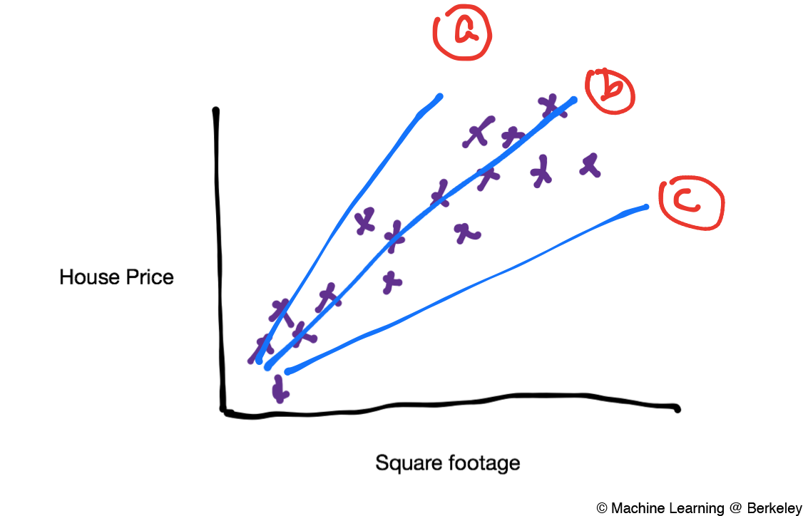
Predictors a and c don’t really fit the data very well, and our cost function should give the two lines a high cost. On the other hand, predictor b seems to fit the data very well, and as a result our cost function should give it a very low cost.
100
You can play around with a cost function yourself using the simulation above. Click and drag data points and the line to move them around, and double click to make new data points.
So just what is the cost function? There are actually many different types of cost functions we can use, but for this example we’ll stick to a very commonly used one called the mean squared error.
Let’s break down the name “mean squared error.” Error in this case means the vertical distance between a data point and a predictor, or just the difference \((x_{i} - y_{i})\). We can visualize the error by using the graph below, where each of the bars is a different \((x_{i} - y_{i})\).

So for a single data point \(\left( x_{i},y_{i} \right)\), where \(x_{i}\) is the square footage of the house and \(y_{i}\) is the price of the house, and a predictor \(y(x)\) the squared error is:
\[e=\left( y\left( x_{i} \right)-y_{i} \right)^{2}\]The nice thing about the square of the error is that everything is positive. This way we can actually minimize the squared error. Now we take the mean, or the average, over all the data points to get the mean squared error:
\[\mbox{C}=\frac{1}{N}\sum_{i}{\left( y-y_{i} \right)^{2\; }}\]Here, we’ve summed up all of the squared errors, and divided by N, which is the number of data points we have, which is just the average of the squared errors. Hence, the mean squared error.
Gradient Descent
When we graph the cost function (with only two variables) it will look something like this:
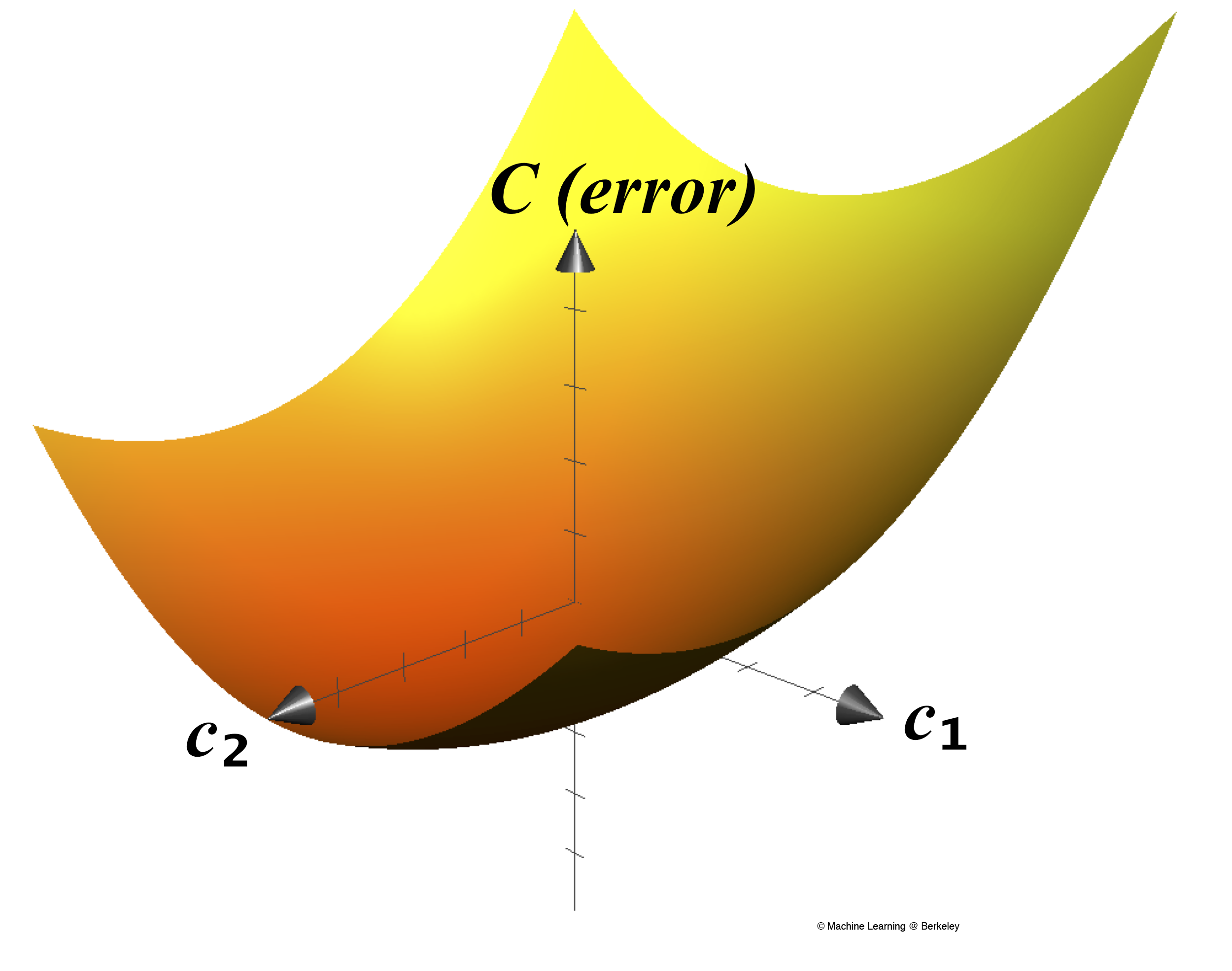
Now, it’s pretty evident where the minimum of this cost function is. We can just eyeball it. However, remember we only have one feature—square footage. In reality, almost all applications for modern machine learning algorithms take in much more than just one feature. In some cases, up to tens of millions of parameters are used—have fun trying to picture a ten million dimensional space!
So, in order to find the minimum of very high dimensional cost functions, we’ll use an algorithm called gradient descent. As we’ll see soon gradient descent has a very intuitive explanation in two dimensions, but the algorithm also generalizes readily to any number of dimensions.
To begin, imagine rolling a ball along the cost function graph. As the ball rolls, it will always follow the steepest route, eventually coming to rest at the bottom. In a nutshell, that’s what gradient descent is. We pick any point on the graph, find the direction that has the steepest slope, move a tiny bit in that direction, and repeat. Eventually, we necessarily have to reach a minimum of the cost function. And because that point is the minimum of the cost function, it’s also the parameters that we’ll use for drawing our line.
So, what did I just learn?
So after reading all of that, hopefully machine learning is starting to make more sense to you right now. And hopefully, it doesn’t seem as complicated as you once thought it was. Just remember machine learning is literally just drawing lines through training data. We decide what purpose the line services, such as a decision boundary in a classification algorithm, or a predictor that models real-world behavior. And these lines in turn just come from finding the minimum of a cost function using gradient descent.
Put another way, really machine learning is just pattern recognition. ML algorithms learn patterns by drawing lines through training data, and then generalizes the patterns it sees to new data. But that begs the question, is machine learning actually “learning”? Well, who’s to say learning isn’t just pattern recognition?
